The key to breaking down the communication barrier between me and my audience often lies in a great visual. I have written untold whitepapers with what I consider clever themes but my message lives or dies based on what happens with the graphics that are used around my (oh so) clever copy.
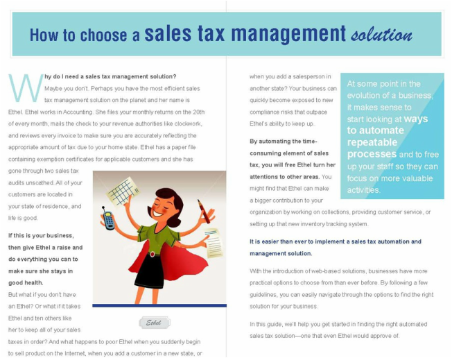
Here is an example of a whitepaper I originally crafted for a start up sales tax software company. The layout is my favorite example of excellent design. The designer, Dirk Mynatt, who must have read at least one or two paragraphs about sales tax, played off of my main character who I named "Ethel". Ethel, a model employee, is the low tech alternative to an automated solution.
The designer wisely chose a retro theme for the layout.
In this version, Ethel has been sent off to a nursing home and is now wearing a dopey grey suit. You cannot even make yourself read enough of this dry looking copy to find out about poor ole Ethel.
I get big corporate brand policy. I understand consistent look and feel but it's a big fat bummer.
Do the brand police have to suck the life out of everything? Where's the visual interest? The humor?
For me, it all comes down to finding clients who get my message. Who fit with my tone and style. Who value good design. That's when I can do my best work. Good design makes my words cleverer (?). (It doesn't however fix bad grammar, or stupid. That is all me.)
I miss the little guys who would take risks and have some fun.


 RSS Feed