The results of the primaries on Super Tuesday were very interesting to watch - and not just because of the historic changes in our choices or the dollars invested in campaigning. The interesting part to me was the way in which each of the news venues displayed the numbers. Apparently, they have decided that providing election results in numeric form is just not good enough.
I could not help noticing all of the different technologies that were being employed - from the touch screen map that expanded or contracted based on the reporters' focus, the "what-if" analysis of different elections on the candidates' delegate counts (shown on an adjustable pie chart), or the various numbers behind the numbers showing how different groups voted for different candidates. I think they were on the right track in terms of finding ways to make the results more interesting and vivid, but in some cases the whirling, moving, expanding, contrasting graphics made it hard for me to concentrate on the message.
I was not the only one who noticed. The Daily Show featured a segment this week on this very subject. The Fox News spinning pie chart that moved with Anderson Cooper's head was their favorite misused graphic.
So in summary, visuals are usually better than just numbers, numbers in context are better than stand-alone figures, and "what-if" views of information are more lively than static results. Just use these different techniques sparingly in your presentations so your message doesn't get lost in a sea of dazzling special effects.
|
0 Comments
If you haven't seen the show, these are the main points. It's a team of new designers who are given an assignment, a limited budget, and a limited amount of time to create something that meets a given design objective. They are given models who wear whatever outfit they create for judging by a team of experts. The losing designer is off the show at the end of the segment. |
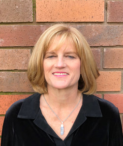
Geni Whitehouse CPA, CITP, CSPM Author, speaker, trainer > 50% Countess of Communication, Brotemarkle,Davis Co. > 50% Writin', speakin', consultin' Co-founder of SolveServices.com a remote bookkeeping service for wineries. How to hire me. Author How to Make a Boring Subject Interesting : 52 ways even a nerd can be heard I have a ton of other websites including my newest for Twitter newbies www.evenatwit.com Originally from Greenville, SC, I now live in Napa, California. Contact Geni
I am an accountant on a mission. I want to permanently remove the blight of BORING that has attached itself to members of my profession.
But the boring blight doesn't stop there. It's everywhere. I've found it in wineries (although it's a tad more palatable when served with alcohol), in science labs, even in Art museums. And technology people carry the "B" gene too. But the condition need not be fatal. I lecture around the country to accountants and technology audiences and I have a ball. I was a partner in an Atlanta CPA firm when I realized technology was my true passion and I have been fighting the nerd versus geek battle ever since. Through some stroke of absolutely amazing luck, I now find myself in Napa -- the most gorgeous, hospitable place imaginable. Are you on Twitter? You can follow my nerdy life there : evenanerd Contact me geni@evenanerd.com I am a graduate of the Jeff Justice Comedy Workshoppe and the Persuasive Speaker course taught by Speechworks. I highly recommend both of these organizations. I have also taken training from the amazing Lynda Spillane. I am not unbiased, nor do I wish to be. I have done work for anyone and everyone in the software industry or the accounting profession. If I am not impressed by what you do or can't find an angle that is interesting or unique, I won't work for or with you. And if you are stodgy or boring, there are not enough dollars or even euros to make me help you. See samples of my writing here: www.salestaxradar.com www.mybizcounts.com Archives
July 2017
Categories
All
Other websites you might enjoy: |


 RSS Feed